
College baseball season is oh so close, and the notion of heading back to Baum-Walker Stadium to watch the start of the Arkansas baseball season this weekend has never been more appealing.
Given the disastrous football and basketball seasons on the Hill this year, fans’ longing for baseball has been even more extreme than usual. From daily countdowns to preview articles, hardly anybody can wait for that first pitch.
A recent wave of preseason chatter came last week when Alumni Hall, a Razorback apparel store in Fayetteville, put some new baseball jerseys on sale. While nothing official had been announced yet, fans began to speculate as pictures of the jerseys hit social media. I’ll just come out and say it, and I won’t mince words: They’re hideous.
Unfortunately, it looks like these designs might be more than just fan-shop fodder. Mark Taylor, the head of baseball equipment operations for the Razorbacks, posted a picture on X (formerly Twitter) of him hard at work on Super Bowl Sunday. Pictured is an SEC badge getting stitched onto a pinstriped white jersey.
What’s that red lettering peeking out from the folds? The infamous Nike tiny-font. Doomsday is here, folks. Let’s get into it.
Analyzing the Arkansas Baseball Jerseys
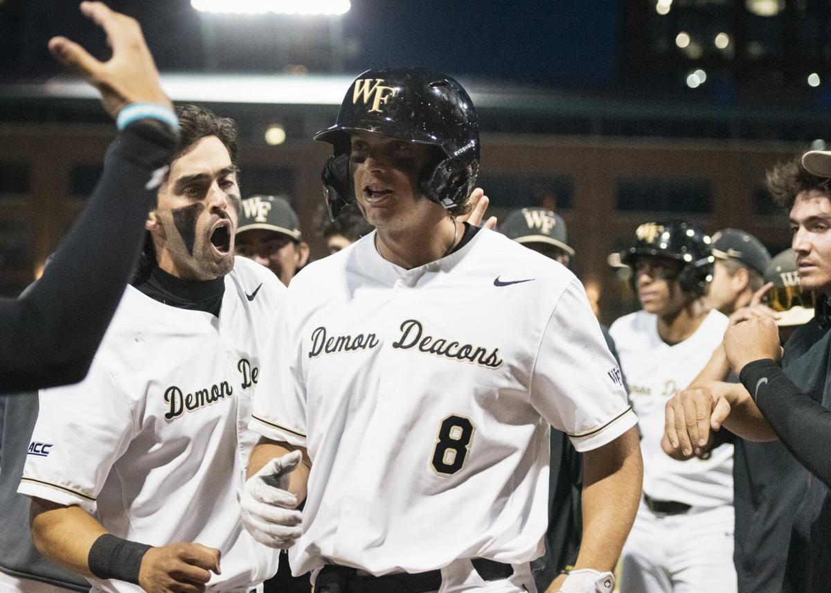
First off, the home and away jerseys are just terrible. They look more like batting practice shirts than something you’d actually wear in a game, and they remind me of Wake Forest’s microscopic font size on its jerseys. After seeing those at the College World Series last year, my dad exclaimed that he “couldn’t even tell which team they were!” So true, dad.
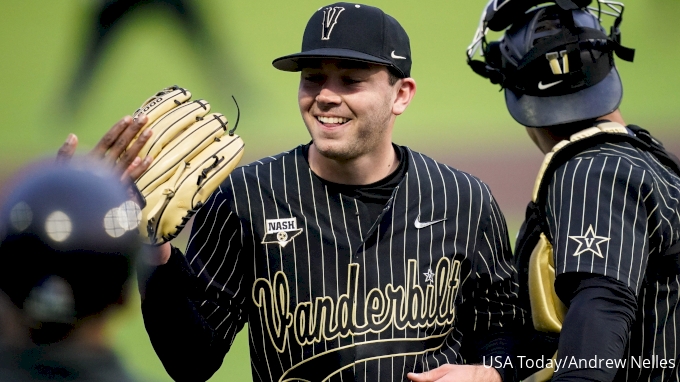
As far as the pinstripes, the Hogs are better off leaving those in the past, where they belong. They aren’t the New York Yankees, and they shouldn’t try to be, either. The only team currently making the stripes work is the Vandy Boys, but you can only really watch their games on mute because of that obnoxious, shrill noise coming from the stands.
The worst part of it all is that some fans actually seem to support these concept jerseys, despite the fact (yes, it’s a fact) that the Razorbacks currently boast one of the most gorgeous uniform lineups in the entire country.
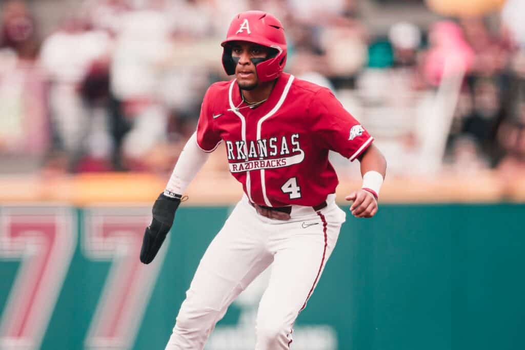
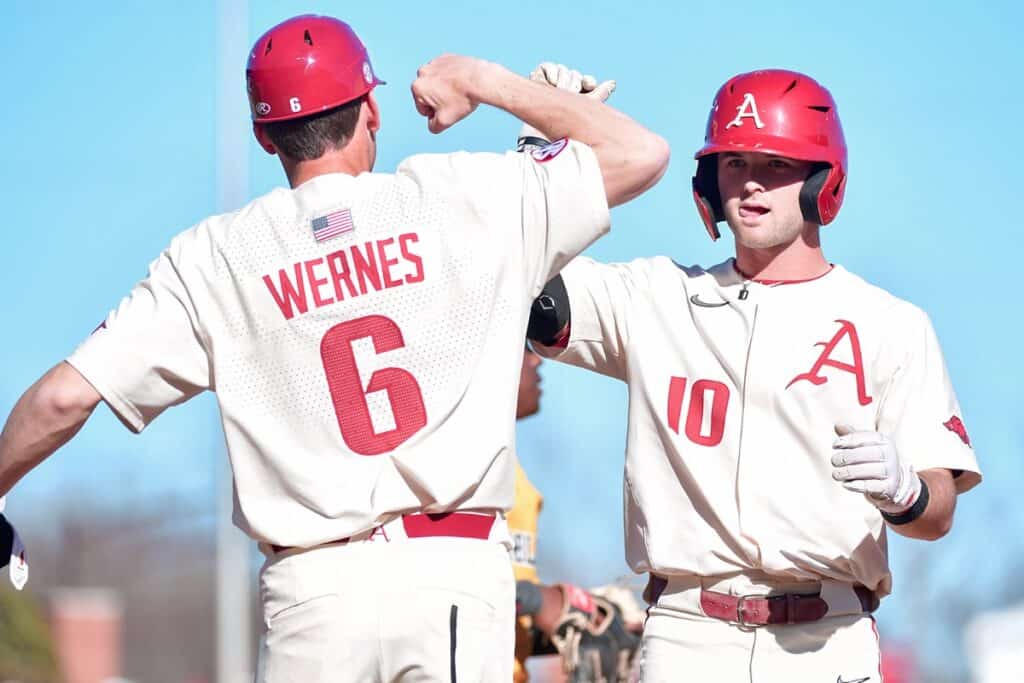
The red script alternates and the classic Sunday creams are both a 10 out of 10. One might even go as far as using the colorful language of Bret Bielema: “borderline erotic.”
Give a scroll down recent memory lane here:
Mason is right. Be more like Mason.
I mean, come on. It doesn’t get better than that. Chef’s kiss.
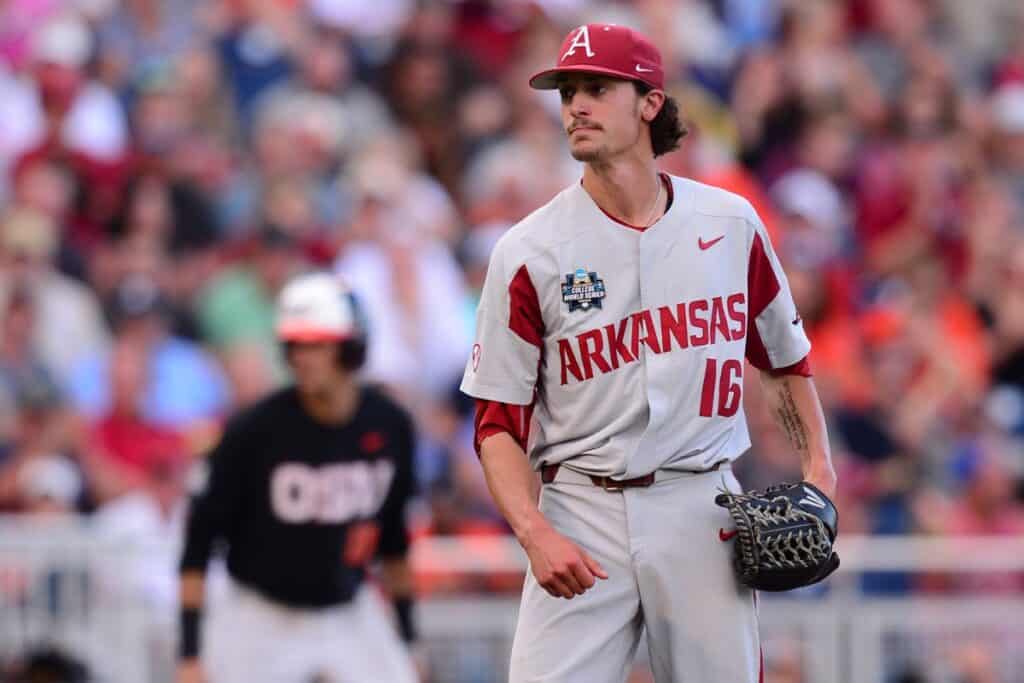
As far as Arkansas’ traditional home and away jerseys, they’re a nice mix of classic and clean. They’re sleek and mature – not like Ole Miss’ powder blues, which look more fit for a U13 travel ball team than anything else. They’re not perfect, and they don’t blow you away, but that’s alright. That’s what the Michelin-star alternates are for.

If the Hogs were to hypothetically change those classic gray and white jerseys to something else, the Alumni Hall abomination is the wrong way to go. Ditching the tiny-font horror, this X user rendered up some lovely script-style concepts.
These are easy on the eyes, especially for those with a disdain for the Jeff Long-era “Razor-Font” that currently adorns the baseball jerseys. The decision to leave that behind in the 2010s proved to be a good one for the football team, which has undergone a major face lift with a shift back to a more traditional look:


The State of Arkansas Basketball Jerseys
While I’m on this soapbox, I have to say a few words about the Arkansas basketball uniform situation. Razorback fans were treated to a new look in Saturday’s win over Georgia. They’re a new throwback-style set, and they’re absolutely beautiful.
While these are gorgeous, I just know I’ll end up feeling frustrated by the time Arkansas vs Tennessee tips off tonight. The team repped those in Bud Walton Arena this weekend and looked fantastic – yes, that definitely played a factor in Arkansas’ victory – but then they’ll put them back on the shelf and go back to the same mediocre standard set of jerseys.
Forget the the never-ending changing starting lineups we have seen this season, the real travesty is the dozen-or-more uniform combinations that Musselman’s squad dons year in and year out. The blame for this lies entirely in that previously mentioned Long-era holdover. Because of the microscopic “Razor-Font” overstaying its welcome, the only salvageable combinations the Hogs currently have are their throwback looks.

Brace yourself when I say this…but this picture makes it clear the formatting of this jersey is shockingly similar to that of Missouri, which is universally recognized as an eyesore.
Luckily for Arkansas’ design team, they won’t even have to go through the process of drawing up a new look. The upgrade in question is already sitting in the uniform closet, we just need to make the full-time switch.

1994 throwbacks for every game. Make it happen.

You have this look sitting right there and decide to go back to the mediocre standard digs. It makes no sense.
With the addition of these classic logo jerseys and the latest throwbacks we saw on Saturday night as alternates, Arkansas could upgrade to one of the cleanest uniform sets in the country. The Slobbering Hog at center court is a debate for a different day, but a permanent switch back to 1990s-style outfits would be a most welcome sight.
Back to Arkansas Baseball
Circling back to the original point on the Diamond Hogs debate – if it ain’t broke, don’t try to fix it. Here’s to hoping that Arkansas baseball won’t cave in to the tiny-font epidemic of the uniform world.
The good news is that those jerseys being sold at fan shops is not a guarantee that the team will ever wear them, let alone herald a full-time switch of the uniform rotation. Alumni Hall has sold a red variant of the cream jerseys for years, but the Razorbacks have never stepped out of the dugout wearing them:

So please don’t ruin one of the best uniform sets in the country, especially not for some eyesore pinstripes and a practice shirt disguised as a jersey.
While it certainly looks like the pinstripes will be making a return to the rotation, we can cross our fingers that the other two tiny-font horrors stay locked away in fan shops – far, far away from Baum-Walker Stadium. It brings me joy every weekend knowing that the Diamond Hogs are going to kick some ass, and look good doing it. Here’s to hoping that can continue.
***
More coverage of Arkansas baseball from BoAS…
